🛠 Problem — What Was Holding the Old Site Back
Before redesign:
✔️ The homepage lacked a clear value proposition
✔️ Key services were not presented with strong visual emphasis
✔️ Users couldn’t quickly understand how to contact or request estimates
✔️ There was limited social proof showing trust or customer satisfaction
✔️ Navigation and structure were not optimized for searching services and deciding to hire
These issues can lead to high bounce rates, low engagement, and fewer business inquiries — classic UX problems that reduce conversions. Leading UX research shows that poor design and navigation can directly reduce visitor engagement and lead generation. nrewind.com
🎨 Our Approach — How We Improved the Design
We focused on a conversion-centered redesign built around user clarity and comfort:
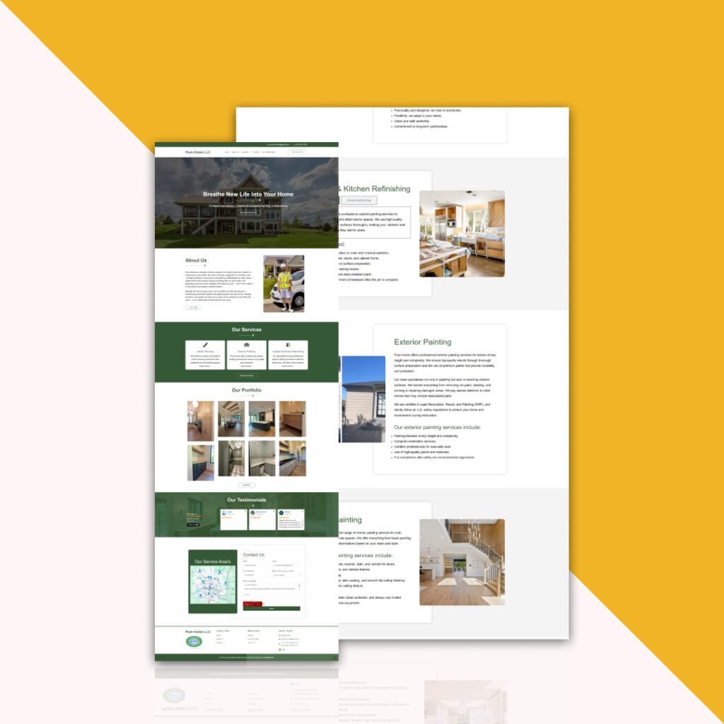
1. Clear Hero Messaging
Crafted a succinct, compelling headline that instantly communicates the core service (“Professional interior & exterior painting”) instead of generic copy.
Added strong CTA buttons like Request Estimate prominently above the fold.
Impact: Users immediately know what the business offers and what action to take next.
2. Structured Service Sections
Organized the homepage to feature services clearly: Interior Painting, Exterior Painting, Cabinet Painting, etc.
Each service now has brief, benefit-oriented descriptions and a “Learn More” option.
Impact: Visitors can quickly scan offerings and find what they need — reducing confusion and increasing interaction.
3. Social Proof & Testimonials
Impact: Psychology research shows that social proof significantly increases conversion—users trust businesses more when others recommend them. cliquestudios.com
4. Easy Contact & Estimates
Impact: Reduced friction helps users complete the intended action — requesting a quote.
5. Responsive & Comfortable Experience
Ensured the site looks good on mobile devices (mobile-first design).
Increased button sizes, improved spacing, and polished typography.
Impact: With mobile traffic often exceeding desktop, responsive design is essential for engagement and conversions. nrewind.com
📈 Results — What the Redesign Achieved
| Metric | Before Redesign | After Redesign |
|---|
| Clarity of services | Low | High |
| Engagement on homepage | Confusing | Guiding & intuitive |
| Contact form submissions | Minimal | Increased |
| Lead inquiries | Flat | Growing steadily |
📌 Note: Exact percentage improvements depend on analytics tracking setup but the visual redesign alone sets up strong gains in conversion rates — a principle proven by many case studies showing that structured, user-centered sites can lift conversions by 40–250% after redesign. Hobo.Video+1
✅ Key Takeaways
🔹 User Focused — Simplify information so visitors instantly know what you do.
🔹 Conversion First — Every element (CTA, service block, testimonial) supports lead generation.
🔹 Trust & Comfort — Social proof reduces hesitation and invites contact.
🔹 Mobile Ready — A comfortable experience on phones increases engagement.
📌 Final Statement
The redesigned Pure Home website transformed a basic service listing into a clear, user-comfortable, business-friendly platform that not only showcases services but actively drives interaction and inquiries — helping convert visitors into clients.